

Top 5 Wednesday is held hosted by mods Lainey and Samantha over on goodreads 🙂
The Topic this week: Inaccurate Book Covers (Those books that have nothing to do with the story, or the cover model doesn’t look anything like the actual main character, or it’s a really cheesy cover for a great read!)
Great to be back doing a t5w after I didn’t do mine last week :).
I always think covers are so important and even though I shouldn’t, sometimes it’s very easy to judge a book by it’s cover (CLICHE ALERT). I can’t deny that I often choose a book because I like the cover. However, there are a few books I can think of where I haven’t really liked the cover for a number of reasons but have gone on to read the book and really enjoyed it, sometimes way more than I expected. So, here are the five books I chose that have covers that confuddled me.
1)
Anna and the French Kiss by Stephanie Perkins

Urgh. I really, really dislike this cover and I always have. No matter how much I’ve loved reading Anna numerous times, I don’t like the cover at all. As I own the hardcover, I’ve always taken the jacket off when I’ve read it haha. I’m just not a fan of these fake, prissy, badly modelled, cheesy covers. Not for me. The Lola cover is just as bad!
2)
Grasshopper Jungle by Andrew Smith

It’s a horrible shade of green, the text is boring and the only other thing it features is two weird lines that vaguely represent grasshopper antennas and the outline of a lady’s privates, or at least that’s what it looks like to me. It’s a shame because this is actually a really enjoyable book! I’m pretty glad I wasn’t put off enough by this bleugh cover and read it, but really, it needs a new cover!
3)
Nineteen Minutes by Jodi Picoult
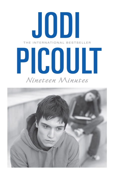
Alright, so this is the only Picoult book I’ve read and I do remember really enjoying it when I read it, probably about 10 or so years ago now. I’ve never liked the cover, I don’t think there’s ever been a Picoult book cover I’ve seen and thought, ooo that looks good! I find this look of a book cover incredibly boring. And with this one, I just don’t think it connects to what the book is about.
4)
Joel and Cat Set The Story Straight by Nick Earls and Rebecca Sparrow
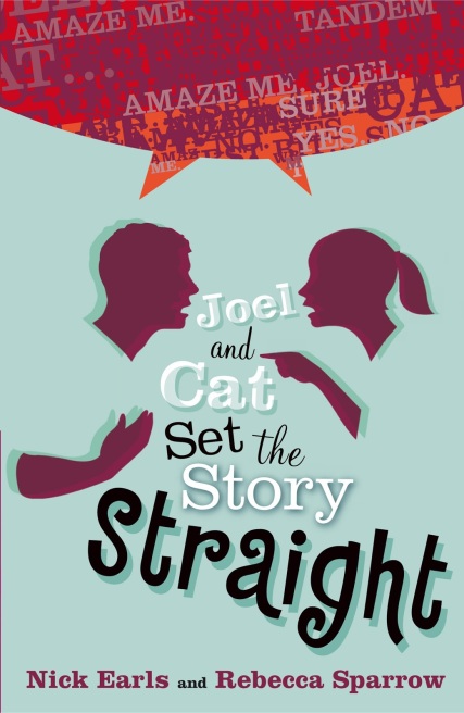
This is a book I really enjoyed reading in high school. I remember borrowing it from the school library, even though I wasn’t very keen on the cover. It’s just one of those badly designed covers that just don’t look good. Though it might be okay if the speech bubble with the weird text at the top just disappeared forever.
5)
Carry On by Rainbow Rowell

I might be a small minority here, but I never liked this cover. When it was revealed, I remember so many people being so excited but I was not impressed. I don’t like the outlines of the faces and how they’ve been coloured in with weird marker looking stuff, I don’t like the Carry On title or how it’s on top of that weird black blob of a castle. The only thing I do like is how Rowell’s name is set out. Otherwise, this cover doesn’t show how good the story inside is in any way. It could’ve been so much better!
What do you think of my tw5? Do you agree or disagree with any of them? 🙂

Anna and the French Kiss is on m list too! The bit that annoys me is that in the book it says Anna has Brown hair with Platinum highlights and that is not the case on this cover! They need to at least get it right for covers like this!
LikeLiked by 1 person
Definitely!! That always annoyed me as well. The models on the front just dont match Anna and St Clair (and I can say that even though you can only see his arm haahah). They wouldn’t wear white for example 😝
LikeLiked by 1 person
Agreed! That’s one reason I hate book covers with actual people on them..
LikeLiked by 1 person
I agree with you–especially on Rainbow Rowell and Jodi Picoult. The Picoult one looks like a bad movie tie-in.
LikeLiked by 1 person
Definitely does!!
LikeLiked by 1 person
These are great choices!! Your comment about the grasshopper cover made me smile 🙂
LikeLiked by 1 person
Thanks 😝
LikeLiked by 1 person
You’re welcome! 😎
LikeLiked by 1 person
ugh that green cover looks like a knife-stabbing pain in my eye .
Super list , Surprised that you mentioned the book “Lola” on the first book but didn’t introduced the cover , Had to look it up on goodreads and sadly there’s too many books when you type lola in the search box .
Once again , very good (or bad- good ?) list
LikeLiked by 1 person
Hahah knife stabbing pain in eye is a great description of it.
Lola (Lola and the Boy Next Door) is the sequel book to Anna and the French Kiss, that’s why I didn’t give the full title lol.
Thanks, glad you liked the good/bad list haha. And thanks for commenting as always 😊
LikeLiked by 1 person
I definitely agree with Anna and The French Kiss. The photo of Eiffel Tower minus the models would even have been better. I really liked Nineteen Minutes but the cover was just wrong. Great post!
LikeLiked by 1 person
Glad you think so! 😊
LikeLike
I totally agree with Carry On. I *get* the title, since it was the name of Kat’s fanfic (though I’ve never quite understood if the novel IS Kat’s fanfic or not), but the cover itself is soooooo boring.
LikeLiked by 1 person
Hahaha yep the whole fanfic thing is pretty confusing, and I don’t have an answer for you haha. Glad you agree with me on the cover! 😊
LikeLiked by 1 person